Gmail for iPad Becomes a Smooth Operator
By Jared Newman | Thursday, August 19, 2010 at 9:45 am
 Like it or not, technology has a vain side, one that strives to make things pretty as well as functional.
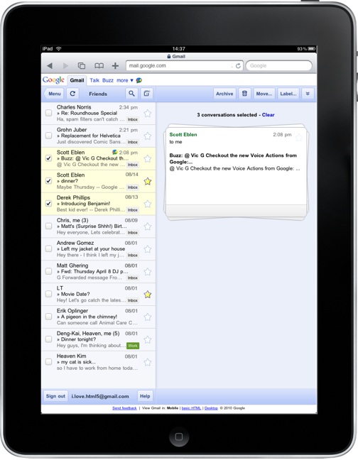
That’s the side Google is appealing to with Gmail for iPad’s new “stacked cards” interface. Now, when you select an e-mail from the left column, the message slides out into the right column with a smooth animation. Selecting more e-mails creates a pile of messages, like hastily stacked index cards (hence the name), which can be deleted, archived or moved in bulk.
Sure, the stacked cards have a function. They address a problem with Gmail for iPad in which the two columns were controlled independently. Previously, if you checked off an e-mail on the left side, and then hit “delete” on the right, Gmail would delete whatever e-mail you were currently reading, instead of the one you selected. The stacked cards eliminate confusion by treating the two columns as one.
Being a vain geek, I’m more interested in the cards’ smooth animations. Google says it used CSS3 transitions, and posted a lengthy technical description to the Google Code Blog. On the main blog, the company says that CSS3 gives mobile web apps “a similar look and feel to native applications.”
See where this is going? For Google to have great faith in Chrome OS (especially if a tablet is in development), and cloud software in general, web apps have to behave like native apps. Sometimes, that means coming up with solutions like Google Cloud Print and HTML5 gaming.
Other times, it’s all about looking good.
2 Comments
Read more:


August 19th, 2010 at 10:43 am
Really quite pleasant. I'll probably switch to it for checking my very lightly used GMail account.
August 21st, 2010 at 5:50 am
You could have saved a lot of words by saying that it mimics the look and feel of Apple's Mail app.