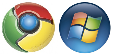
Google Chrome: Hey, That Logo Looks Vaguely Familiar
By Harry McCracken | Monday, September 1, 2008 at 6:39 pm
(UPDATE! I’m conducting a poll about Chrome–please go here to take it, and to get a recap of all of Technologizer’s Chrome coverage.)
Google has posted an official online version of the Scott McCloud comic book introducing Chrome, its new browser, and the cover sports the Chrome logo. The logo reminds All Things Digital’s John Paczowski of a favorite gadget of the past, but I was also reminded, less literally, of a prominent logo of the present:

No, the Chrome and Windows Vista logos are not true twins, but they’re both round and shiny, with the same color scheme–red, green, yellow, and blue. (Okay, looking at the Vista logo, that’s more of an orange than a red, but close enough.) If you’d told me that the Chrome logo was what Microsoft had come up with for Windows Seven, I’d have believed you.
Microsoft has long used the colors as shorthand for Windows and related products such as Office. But I didn’t draw any immediate association between the Chrome logo and Google branding in general until I realized that it uses the same colors as the Google logo:

On some level, it probably makes sense for the Chrome logo to look a bit like the Windows one. Much of the punditry concerning Chrome is looking at it as a threat not to Internet Explorer so much as to Windows itself–a platform for Web-based applications that might, over time at least, do some of the things that we expect an operating system to do at the moment. You gotta wonder whether it’s just a coincidence that Chrome is launching first on Windows, or whether Google is in fact a lot more interested in introducing Chrome to Microsoft customers than to Mac fans or Linux types. (Of course, it’s more likely that there’s nothing nefarious going on: If most of the world uses Windows, it’s completely logical to get the Windows version of Chrome out first.)
Meanwhile, as I was writing this post, I was watching MSNBC coverage of Hurricane Gustav out of one corner of my eye–and happened to see an ad for Alli, a weight-loss products. Its logo looks like this:

And I just remembered the logo for Zoho, one of my favorite suites of Web-based apps:
Popular color scheme, huh?
30 Comments
Read more:
20 Comments For This Post
10 Trackbacks For This Post
-
Google lance son navigateur au moyen d’une BD - Transnets - Blog LeMonde.fr Says:
September 1st, 2008 at 11:17 pm[…] du système d’exploitation que Google veut déplacer. Le logo, remarque Harry McCracken, rappelle incroyablement celui de Vista […]
-
As possíveis inspirações para a criação do logo do Google Chrome [humor] - Google Discovery Says:
September 5th, 2008 at 6:16 am[…] Imaginado pelo Harry McCracken. […]
-
مغز آزاد » Blog Archive » لوگوی مرورگر کروم از کجا ایده گرفت؟ Says:
September 5th, 2008 at 11:06 am[…] Harry McCracken در یک مقاله تشابه لوگوی کروم رو با لوگوی ویندوز ویستا مقایسه کرده […]
-
- Informatizado| Blogando conhecimento - Says:
September 5th, 2008 at 12:45 pm[…] Imaginado pelo Harry McCracken. […]
-
Humor - Da onde veio a inspirações para a criação do logo do Google Chrome? | Leopoldo Moreira Says:
September 5th, 2008 at 4:36 pm[…] Imaginado pelo Harry McCracken. […]
-
La verdad detras del logo de Google Chrome | Tecnología Diaria Says:
September 7th, 2008 at 5:50 pm[…] osado es Harry McCracken quien realizó un particular análisis entre la similitud del logo de Chrome y el de Windows Vista, […]
-
El curioso logo de Chrome | Tinta Fantasma Says:
September 8th, 2008 at 8:24 am[…] En esa imagen se pude ver las comparaciónes, que en varios lugares se han comentado, entre el logo de Chrome y diferentes productos, desde una pokebola hasta con el logo de firefox (menos improbable), pasando incluso por compararlo con el logo del Windows VISTA. […]
-
What Inspired the Google Chrome Logo? « Google Chrome Addict Says:
October 1st, 2008 at 8:52 pm[…] logo to the ThinkFree Office 3 logo. They do appear to be separated at birth. Tecnologizer claims it looks like another familiar logo, you decide […]
-
The inspiration behind the logo design of Google -Chrome ;) « Techie Stuff! Says:
April 18th, 2010 at 1:54 am[…] Earlier, Harry McCracken wrote about some similarities he found between the logo design of Google Chrome and that of Windows Vista – “No, the Chrome and Windows Vista logos are not true twins, but they’re both round and shiny, with the same color scheme–red, green, yellow, and blue.” […]
-
Sandheden om Chromes logo | MartinBonde.dk Says:
December 16th, 2010 at 12:21 pm[…] har Harry McCracken skrevet om sammenfald som han fandt mellem designet af Google Chromes logo og Windows Vistas logo […]


September 1st, 2008 at 6:58 pm
actually, it looks more like a modern-day Simon Says – http://tinyurl.com/simonsays
September 2nd, 2008 at 9:21 am
It’s clearly the most advanced Pokeball ever made.
September 2nd, 2008 at 11:22 am
I really like the chrome logo. Very tasty and shiny 😉
Regarding the use of primary colours, they’re usually used to denote ‘simplicity’ as they tend to be the first colours we learn as children.
September 2nd, 2008 at 11:25 am
My opinion about the logo of Chrome : http://graphism.fr/post/48378893/la-1ere-erreur-de-google-chrome
September 2nd, 2008 at 1:29 pm
The Chrome logo reminds me of Simon Sez (or something like that). It’s a handheld game that plays sounds; with the objective of the player mimicking the sounds by touching the colored panels.
http://www.goodyblog.com/playing_house/2007/11/simon-sez.html
September 2nd, 2008 at 5:27 pm
lol it does look like a pokeball…but I’m using it regardless…
September 3rd, 2008 at 1:31 am
I have installed Google Chrome and found browsing fun with its simple Gtalk like Simplicity. I’ll stick with FireFox for now until Chrome gets some useful plugins to enhance it.
Read more below
http://www.iwebie.com/googles-chrome-browser-the-iefirefox-killer
September 3rd, 2008 at 2:18 am
lol primary active colours: red, green, blue
primary passive colours: red, yellow, blue.
So, the author has noticed that businesses use the primary colours on their logos. Good work
September 5th, 2008 at 8:30 am
September 5th, 2008 at 8:31 am
Making story of Google Chrome Logo (exclusive)
http://blog.thinkfree.com
September 30th, 2008 at 10:12 am
As far it doesn’t support Google toolbar, its not as compatible as windows IE 😉
Jack, http://seoapplied.blogspot.com
September 30th, 2008 at 1:37 pm
Ah yes, Alli. You ever read the list of side effects for that stuff? Eeek 🙂
October 18th, 2008 at 1:49 am
Good Post! very interesting
http://www.webinteresante.com
May 12th, 2011 at 12:27 am
yes it very much familiar with the microsoft but it also looks good
Logo Design
May 27th, 2011 at 4:11 am
google introduce nice design
October 7th, 2011 at 4:52 am
its really a good resource your blog has contain remarkable things which will surely be helping for any one !! thanks a lot for sharing this useful post ….
November 26th, 2011 at 3:11 am
Herbal Vitamins
i like your blogs
herbal vitamins | natural minerals | anti aging vitamins | herbal supplements | Curcumin | Curcumin | Krill Oil
December 1st, 2011 at 11:56 am
Great post I like it very much !!! I will use it on my blogPakistani Dresses
January 19th, 2012 at 3:39 am
I had really like it very much for providing the different info in this blog. I am really thanked to visit the nice info in this blog and using the great service in this blog.
February 20th, 2012 at 10:40 pm
Blogging is not rocket science, it’s about being yourself, and putting what you have into it.