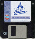
AOL Becomes Aol.
By Harry McCracken | Monday, November 23, 2009 at 9:11 am
 As part of its retooling as it becomes an independent company (again!), AOL is unveiling a new logo. It dumps the triangle that has been part of the corporate identity since the company’s glory days, and spells the name “Aol”–upper and lower case, with a period. (It’s been a long time since AOL has called itself “America Online”–it no more uses that moniker than AT&T likes to be called American Telephone & Telegraph.)
For reasons I don’t quite understand, AOL (AOL.?) is making a big deal out of the notion of overlaying the new logo on an array of imagery (which, among other things, shows how hard it is to make typography read unless it’s a consistently light color on top of a consistently dark one, or vice versa).

It’s always fun to read what a company has to say about a redesigned logo.
The new AOL brand identity is a simple, confident logotype, revealed by ever-changing images. It’s one consistent logo with countless ways to reveal.
[snip]
Our new identity is uniquely dynamic.
[snip]
[snip]
Historically brand identity has been monolithic and controlling, little more than stamping a company name on a product. AOL is a 21st century media company, with an ambitious vision for the future and new focus on creativity and expression, this required the new brand identity to be open and generous, to invite conversation and collaboration, and to feel credible, but also aspirational.
Hey, when I worked at PC World and we redid our logo, we spent umpteen hours talking about its personality–in surprisingly similar terms. (I don’t think any company ever redesigns its identity to feel closed, stingy, and erratic.)
In the long run, of course, it’s deeds rather than visuals that determine how people feel about the companies they do business with. Other than using the AIM network for instant messaging–and only the network, not the software–I’m not sure if I have a relationship with AOL anymore. Do you?
7 Comments
Read more:
6 Comments For This Post
1 Trackbacks For This Post
-
Wayne's Workshop » Blog Archive » Daily Run Down: 11-23-2009 Says:
November 23rd, 2009 at 6:56 pm[…] AOL is beginning to rebrand as Aol. […]


November 23rd, 2009 at 9:28 am
It’s even longer since AOL (oops, Aol.) was Personal Apple Link.
November 23rd, 2009 at 10:15 am
Still rhymes with A.O.Hell.
November 23rd, 2009 at 10:59 am
I’m surprised that a company as large Aol would use such a bland logo. The font they are using is plain and uninteresting. Plus, just because there logo is constantly changing doesn’t make them any more “21st century” than they were before.
November 23rd, 2009 at 7:30 pm
AIM is still my most used instant messaging client. I used to be a heavy user but over the years it been replaced with Google and Windows Live. It’s sad to see a pioneer go, I wish them the best of luck for the future. As far as their logo, I’m not impressed at all but then again marketing isn’t easy for every company.
November 23rd, 2009 at 11:39 pm
I said it then and I say it now “AOL and Time Warner was a mistake.”
February 2nd, 2012 at 2:42 pm
I think there is nothing wrong if you will redesign your logo as long as it still reflects your company, then it is okay.